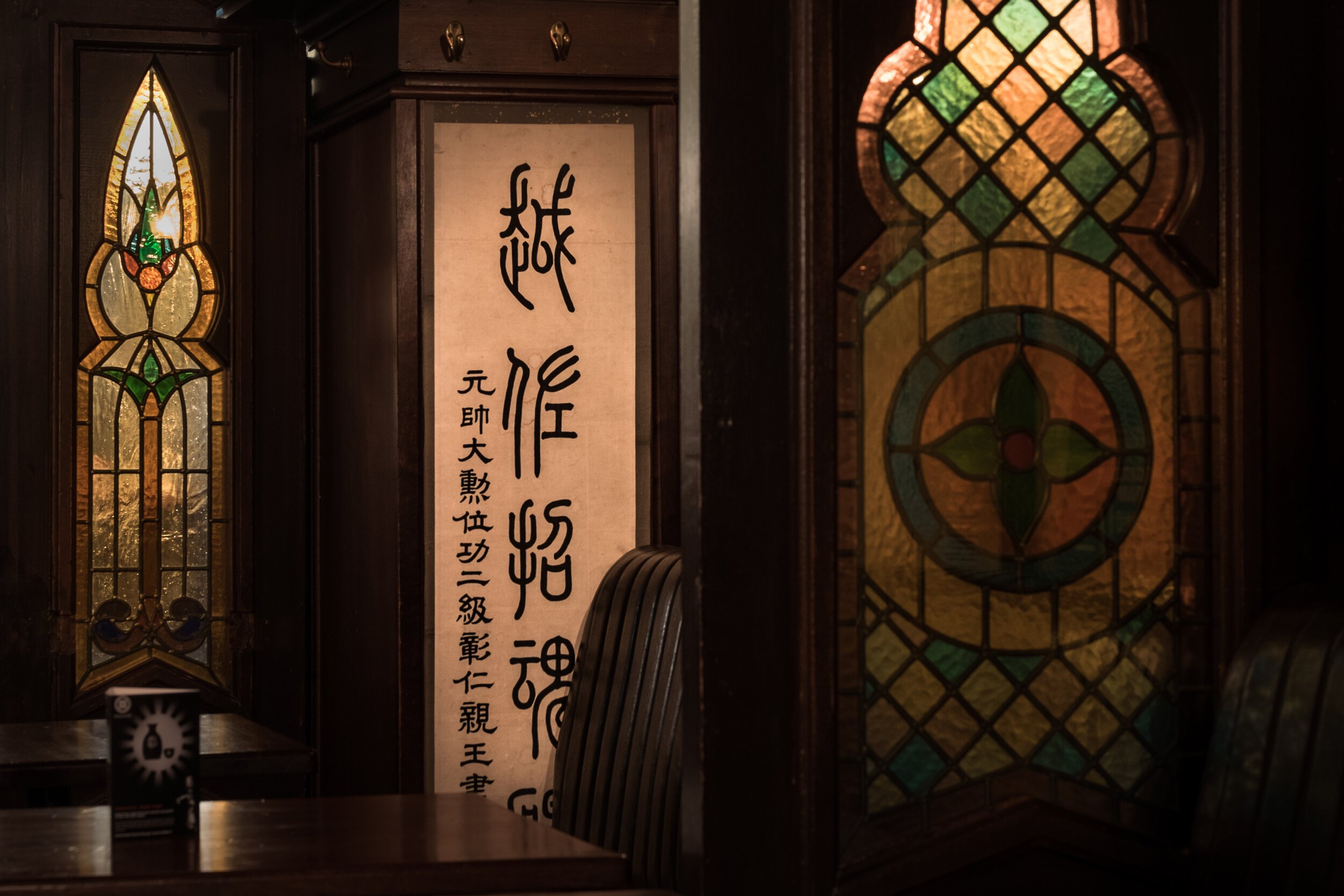
Izakaya Sake Bar
“This Is Our Take On A Japanese Izakaya, Where Traditionally A Variety Of Small Dishes And Snacks Are Served To Accompany Alcoholic Drinks Such As Delicious Sake In An Informal, Relaxed Atmosphere!”
- Yamamori Team
The Brief
To look at how yamamori could increase their business through different means while not damaging the already successful experience they had created for their customers.
The Assessment
After a thorough assessment, we proposed to create a sub-brand within the restaurant called “the sake bar”. With the correct floor plan layout and brand experience, we intended to add to the already successful dining experience.
The Proposal
We saw yamamori izakaya as having two acts, just like a theater show.
Act one - was up until 11 pm where diners would experience the current yamamori dining experience with some new surroundings such as the sushi stage.
Act two - was where we dimmed the lights, turned up the music and pulled the curtains across to give a sense of privacy. This allowed diners to feel more at ease, that they were in no way expected by the staff to leave in fact it was the complete opposite they are encouraged to stay late into the night and enjoy themselves!
Final Results
Parts Of The Project
Exterior Lighting
We installed neon signage and antique globe lights which are technically interior but they were installed with the intention of catching the eye of people outside as well as illuminating specific areas inside.
Art Installations + Table Tents
We commissioned an artist to install this graphic on the mirror and designed table tents with information about sake and how it’s produced
Logo + Signage
We initially had a logo created similar to the logo you see here but there was something missing and that was the personal Yamamori touch! So we got got one of the waiters to sketch out the symbol for Sake and used his personal handwriting to complete the logo.
It worked a charm and his hand writing is forever immortalized in “The Sake Bar” branding!
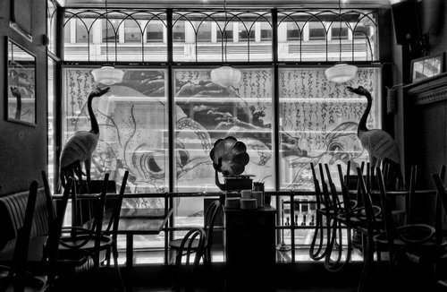
Large Scale Printing
We had an opportunity to do something a little cheeky and went for it as the area was so large it’d be a waste not to print something on it.
I used large scale solvent printing and vectorized the famous image of “The Dream of the Fisherman’s Wife” so it could be scaled up.
The Sake Menu Diagram
After studying Sake I designed this diagram to help educate people about how Sake is tasted. It was initially intended to go on the mirror but in the end we printed it on the menus and it was a great conversation piece for first time visitors to the bar.
The Website
Part of creating the brand and experience was not only physically altering the space and creating a logo but creating a story that starts online.
In another project with Yamamori we created a platform hosting multiple brands online.
You can see Izakaya Sake Bars page below…


